Worten
action button pdp
 Logo
- Client
- Worten
- Role
- Design UX/UI
- Year
- 2025
- Location
- Lisbon, PT
1. Product & Problem
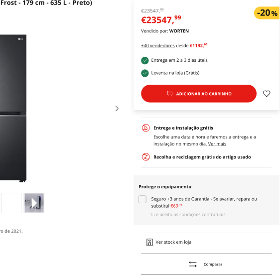
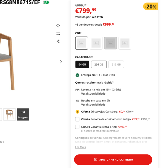
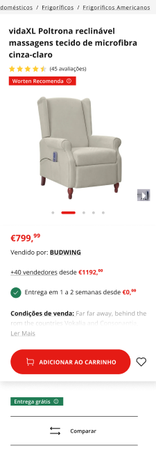
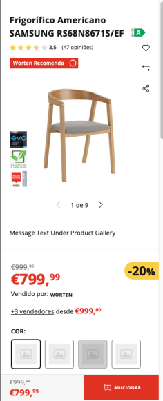
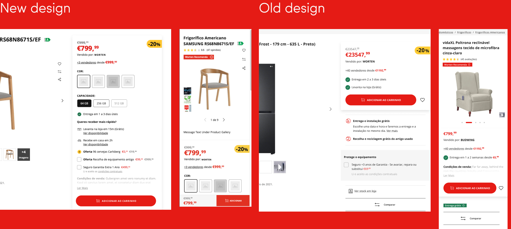
On the product page, the action buttons lived inside the buying box, sharing space with price, seller info and the buy button. On mobile, where space runs tight, favorite, compare and share lost visibility.
What was holding the page back:
- Action buttons cramped in the buying box, competing for attention with price, seller info and the CTA.
- Too many elements competing for focus in the same area.
- Mobile experience compromised by space constraints.
And why placement mattered:
- The gallery is the first large block on the page. That is where the product is.
- The buying box already has one job: leading to the purchase. Everything placed in it competes with the main button.

The product was in the gallery. The buttons were on the other side.
2. My Role & Contribution
UX · PDP. I compared the page with Amazon's and Walmart's, defined where the actions should live, and carried the decision through to handoff, inside Worten's Digital Product team in 2025.
The contribution was not drawing a button. It was showing the problem was placement, not form, and backing that with references instead of taste.
3. Key Design Decisions
The redesign moved favorite, share and compare out of the crowded buying box and into a clear, visible area within the product gallery.
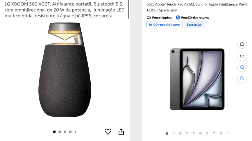
Amazon and Walmart keep favorite and share next to the product gallery. The answer was not to invent a new spot. It was to use the one online shoppers already know.
- Recognition rather than recall: the buttons now appear inside the natural scanning pattern instead of demanding that users remember a hidden location.
- Visibility of system status: clear states and positioning give instant feedback about available actions and the interaction under way.
- Aesthetic and minimalist design: removing buttons from the buying box cleaned the hierarchy and gave the CTA its weight back.


4. The Outcome
Actions that were hidden became interaction points. The hierarchy got cleaner, the CTA got room to breathe, and the experience became consistent across desktop and mobile.
Worten is a real chain with its own app live: 1M+ downloads and 4.7★ on Android, 25 thousand ratings and 4.7★ on iOS. The app changes over time; what is recorded here is the 2025 design.
 Worten on the App StoreView on the App Store ↗
 Worten on the Play StoreView on the Play Store ↗
The button did not change. Where it is seen did.
Need help with a mobile or web product?
I work with product teams on UX, UI and design systems. Tell me about your project.
Get in touch