Tapp –
Travel Guide
 Logo
- University
- IADE
- Role
- Design UX/UI
- Year
- Q2 2022
- Location
- Lisbon, PT
1. Product & Problem
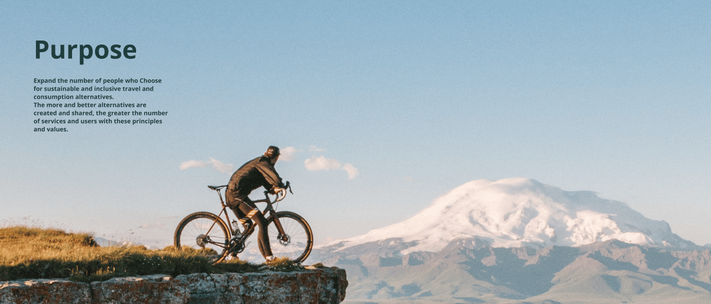
Mass tourism crowds people into the same few spots, and almost all the money leaves the community. The people who host, cook and guide keep the smallest share. Tapp starts from an inversion: instead of listing what is popular, list what is sustainable and inclusive — in all three senses, economic, environmental and human.
The audience is Gen Z and late millennials: people who already choose by values, and for whom “respect for others, respect for the planet” is not a campaign line but a purchase criterion.
So the product problem was not finding places — it was deciding what gets in. A guide that accepts everything is just another aggregator.
A guide is defined by what it turns down.
2. My Role & Contribution
Design UX/UI. I worked on the positioning, the design system and the navigable prototype — the artifact the work closes on.
UX/UI postgraduate project at IADE, Lisbon, 2021–2022, done in a team of five. What is here is my part; the product framing was a collective decision.
3. Key Design Decisions
The central decision was changing what the filter filters. A travel app filters by price, stars and distance — functional criteria, answering how much and how far. Tapp adds sustainability and inclusivity filters, and lets people build their own itinerary from them.
Small change in mechanics, large one in consequence: the itinerary stops being whatever is most popular and becomes whatever fits the person travelling.
- Filter by values, not only by function. The usual filters stay; sustainability and inclusivity sit beside them, not in some hidden “green badge” tab.
- Itinerary built by the user. Instead of handing over ready-made packages, the app hands over the pieces and the criteria — the traveller assembles.
- Curation as a gate, not a label. Only sustainable and inclusive partners make the catalogue. A guide is defined by what it turns down, and that has to hold at the door.
- A channel between who offers and who looks. The product is the bridge, with a governance policy — without it, the criteria become a marketing promise.
To keep the criteria from collapsing into personal taste, the rule came from outside: six UN Sustainable Development Goals bounded what the app will list.
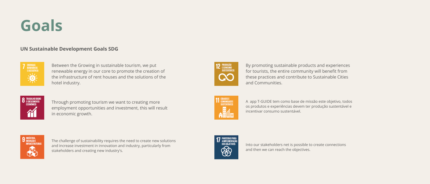
A public rule solves the hardest problem in a curated guide: why this place and not that one. The answer stops being an opinion and becomes something you can check.
4. The Outcome
The work closed with the positioning defined, a design system, and a prototype navigable end to end. As an academic project it never shipped, so there are no adoption numbers to show, and I am not going to invent any.
What remains is the presentation of the work:
 Tapp walkthroughWatch on YouTube ↗
Going off the script only works if someone draws the other route.
Need help with a mobile or web product?
I work with product teams on UX, UI and design systems. Tell me about your project.
Get in touch