Mercadin
 Logo
- Project
- Independent
- Role
- Product · UX/UI
- Year
- 2026
- Platform
- iOS
1. Product & Problem
My mother needed to make and use the grocery list with no one beside her. No single screen was the obstacle. A small keyboard, a wall of text, not knowing where she was in the app, not being sure a tap had worked: small barriers that added up.
The starting question was what has to happen for her to plan and finish a shopping trip with confidence? Mercadin grew out of that need at home. The aim is not more features, it is a trip she can understand from start to finish.
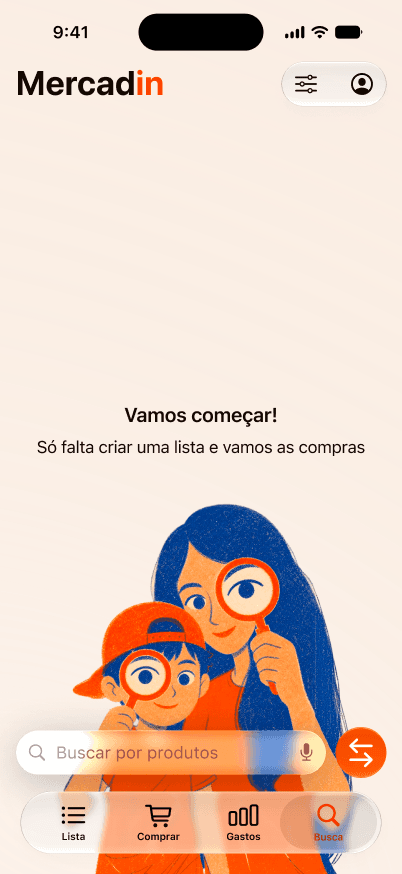
A Figma study of the search screen. The flow is still in development.
2. My Role & Contribution
I lead product strategy, UX/UI and the direction of implementation. The first idea was bigger, with shared prices. Bringing it closer to home, I cut the problem down: before comparing stores at scale, I needed a list a real person could make and use.
I built an installable web version first, to test the list, the aisle grouping and shopping mode. Then I moved the product to native iOS, which opens the way to voice, camera and Apple distribution. The web version was a reference prototype, not a usability test with my mother.
3. Key Design Decisions
- Add without losing the list. The input stays within reach while the list stays in view. The new item appears right there, and the confirmation does not interrupt the making.
- Recognize, do not decipher. Items grouped by aisle, with an icon and a quantity, show what is missing without asking her to read. The app uses the system font, not Casebre's: she has already set the text size on her phone, and a typeface of its own would throw that away.
- Follow the real shopping trip. Planning and shopping are different moments. In shopping mode items can be ticked and progress stays in view, and tapping remains an alternative to swiping.
I explored two wireframe directions, a list by category and a budget-led shop, before joining them in one flow. The budget became an optional layer, not the starting point. The hidden gesture that opens it still needs another look.
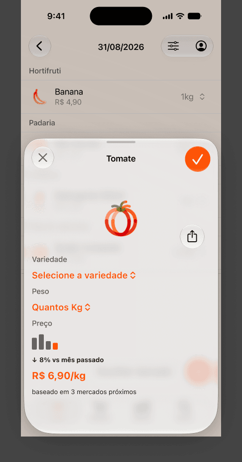
A Figma exploration, not a validated final screen.
4. The Outcome & Next Test
The core flow already lets people make and track lists, tick items while shopping and review spending. The family uses the app at home, but that does not yet prove the main goal: my mother completing a whole list and shopping trip on her own.
The review on 21 September 2026 showed where the product does not yet deserve trust: quantities, categories and prices with errors, and syncing between devices that did not hold in that round. Search still mixes two questions, “what is this product?” and “when did I buy it?”. Contrast, accessible labels and on-screen explanations also need work.
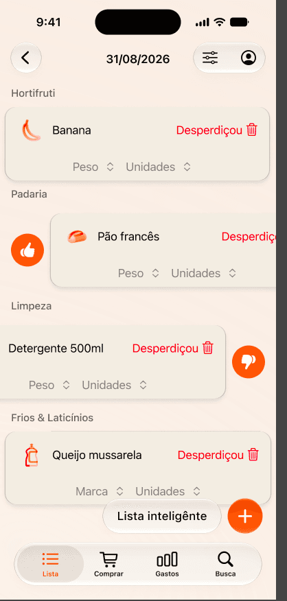
Smart-list concept under review. The layout and data problems visible here are still waiting to be fixed.
The next priority is trust before new features: fix the data, make syncing verifiable and remove the accessibility barriers. Only then watch a whole trip on my mother's iPhone, where she hesitates, when she asks for help, and whether the list stays with her to the end of the market.
Mercadin is still in development and is not on the App Store. Fewer steps were only the beginning. Every answer the interface gives has to be understandable, reversible and reliable, including when something goes wrong.
Before any new feature, the list has to earn her trust.
Need help with a mobile or web product?
I work with product teams on UX, UI and design systems. Tell me about your project.
Get in touch