Lorni
 Logo
- Client
- Welcome The Future
- Role
- Design UX/UI
- Year
- Q2 2021
- Location
- Salvador, BR
1. Product & Problem
School software tends to be designed for the school that has broadband. Lorni was designed for all of Brazil, where the network drops, the data plan runs out on the 20th, and the school can be hours from the nearest town.
That changes what the word “online” means. If the lesson only exists while connected, the platform excludes exactly the people it claimed to reach. The lesson has to come down to the device and keep working with no network.
The second problem is older than the internet: a remote test can be gamed. Digitising the public school is worth nothing if the result is worth nothing.
A product that assumes a good connection has already chosen who it leaves out.
2. My Role & Contribution
UX/UI Design for Welcome The Future, in Salvador, Q2 2021. I worked on the product's three profiles, the wall, and the exercise and test flow.
The connectivity constraint was not a technical detail to solve later. It came in as project material from the start, and it explains almost every decision that follows.
3. Key Design Decisions
Download the lesson, do not stream it. The student takes the content to the device and studies offline. Syncing happens when the network returns, and nothing done in between is lost.
The test is drawn from a question bank. Each student gets a different set, so swapping answers with a classmate stops working. It is not surveillance, it is structure: instead of policing cheating, the system removes what it is worth.
Home is the wall, not the subject list. The first screen is a feed with what the class did, what the teacher posted and what the office announced, filterable by achievements, handouts, exercises and administration. The exercise is answered right there, without leaving for another module.
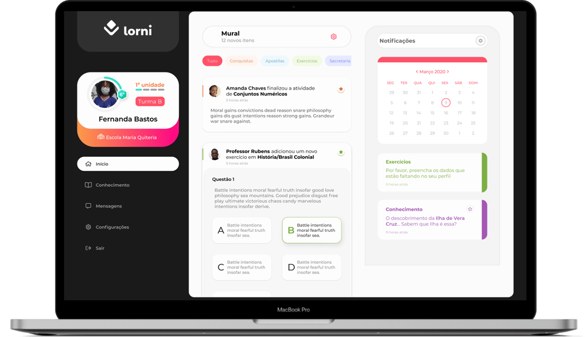
A social feed is the grammar this generation already reads without a manual. Borrowing it was not decoration, it was saving the effort of learning the tool so the effort could go to learning the subject.
The student card says what they belong to. Name, school, class and unit progress stay fixed in the sidebar. For someone in the public system, belonging to Escola Maria Quiteria and Turma B is not metadata, it is identity.
Three profiles, one calendar. Student, teacher and director see the same academic calendar from different angles. For the student, the calendar is what turns a deadline into a commitment, the hardest habit to teach and the most useful one to walk away with.
4. The Outcome
What was designed: a platform that works with the network down, the wall as the front door, exercises answerable in the flow, a question bank with drawn tests, and a calendar shared across the three profiles.
I do not have adoption numbers for this project to show, and I am not going to invent any. What can be checked is the design and the constraint it took on.
The product left the drawing board and is still maintained, today on the Play Store, repositioned as a corporate knowledge platform (the iOS school version was discontinued).
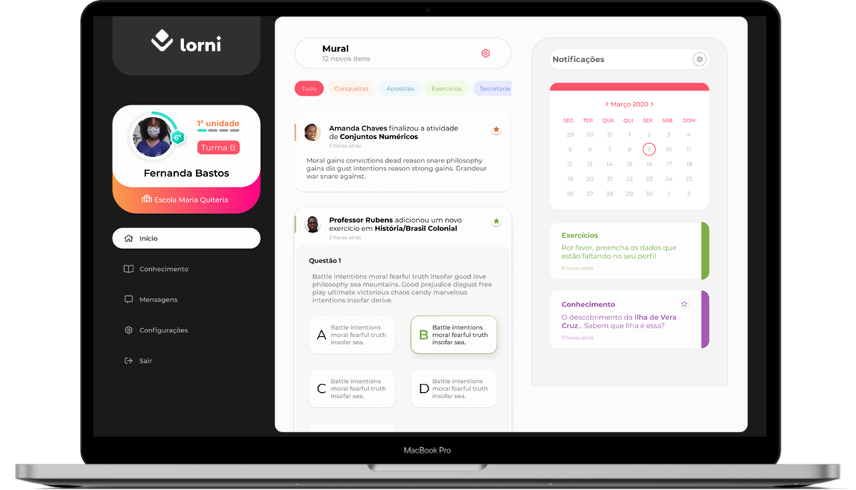 Lorni on the Play StoreView on the Play Store ↗
Reach is not how many schools fit. It is which schools are not left out.
Need help with a mobile or web product?
I work with product teams on UX, UI and design systems. Tell me about your project.
Get in touch