Knowbie
 Logo
- Client
- Welcome The Future
- Role
- Design UX/UI
- Year
- Q3 2021
- Location
- Salvador, BR
1. Product & Problem
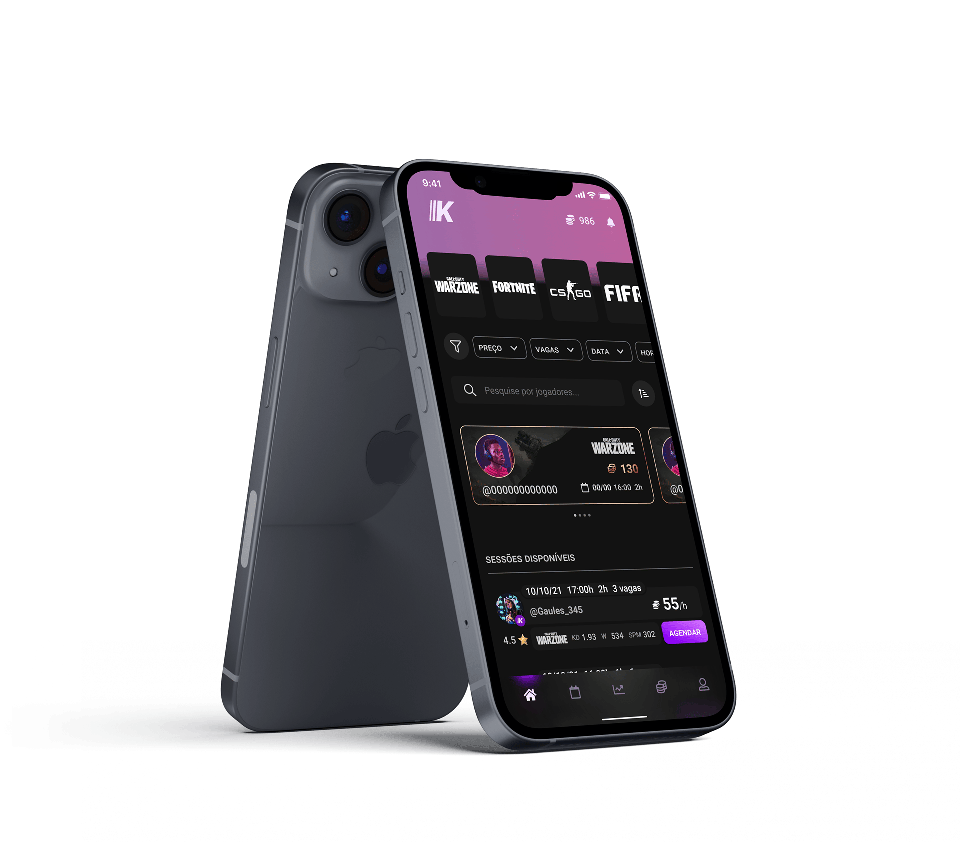
An e-Sports streamer gathers a large audience and a one-way relationship. The people watching never get to play, and the person streaming depends on donations and sponsorship to turn attention into income. Knowbie shortens that distance: the viewer pays to get into the match with the player they watch.
The product question was not how to charge. It was what exactly is for sale. Attention does not sell, and neither does fame. What can be sold is the player's time, cut into hours.
That definition organizes everything after it. If the hour is the goods, it needs a price, a duration, and a number of people who fit in it. The product becomes a calendar, not a shop window.
Defining the goods is the first interface decision.
2. My Role & Contribution
UX/UI Design for Welcome The Future, in Salvador, Q3 2021. I worked on the entry flow, session search, the player profile, and the scheduling system.
Made as a trio: Windson Fonseca, Kaio Murilo and Isabella Vitoria. The product already arrived with marketplace ambition. The contribution was giving calendar shape to an idea that showed up as a shop window.
3. Key Design Decisions
The hour as the unit. Every session carries a price per hour, a duration, and open slots: 55 an hour, 2h, 3 slots. The button is not “buy”, it is book. A session with slots left is idle inventory, and the player sees that on their own screen.
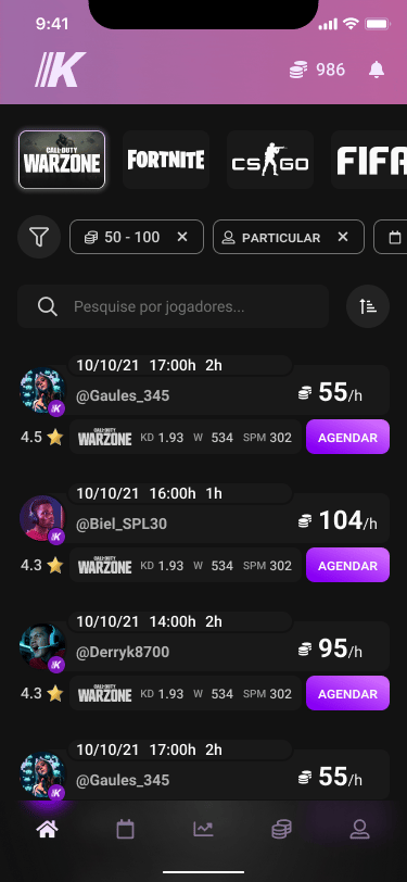
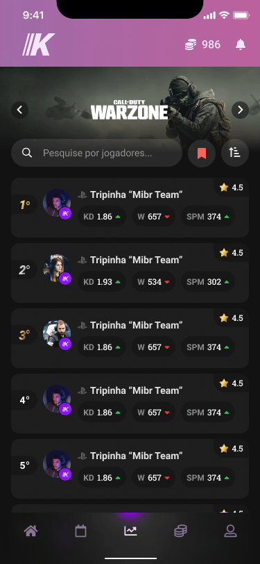
Performance next to reputation. Beside the stars sit KD, wins and SPM, each with a trend arrow. A rating says whether they were good to deal with, the numbers say whether they are good at the game. Someone paying to train needs both, and choosing by data takes the weight off popularity.
Sign-up in steps, with the path in view. Email, password, nickname, photo and games became five stages, with an indicator showing where you are and how much is left. A long form on a single screen is where sign-up dies.
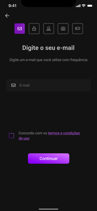
And the refusal holding the rest up: you can skip. An incomplete profile does not block entry. The invitation to finish comes after sign-up, with “Skip” the same size as “Continue”. Demanding a photo and a game list before showing the product is charging before delivering.
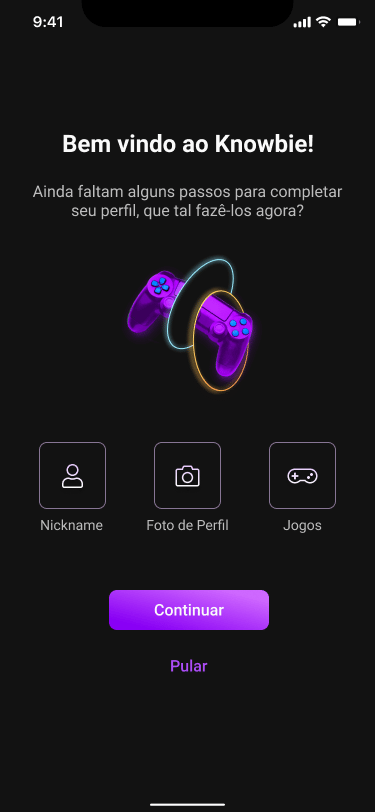
Dark because of the context, not because it looks good. People play at night, and the Knowbie screen shares a monitor with a game and a stream. A light interface there would be a lantern in the middle of the match.
4. The Outcome
What was delivered: a five-step entry flow with a deferrable profile, session search filtered by price, slots, date and time, a player profile with performance and reputation side by side, scheduling, and the coin economy connecting the purchase to the payout.
I do not have adoption numbers for this project to show here, and I would rather not invent any. What can be checked are the screens.
The product left the drawing board and is still maintained: it is on the App Store and the Play Store to this day.
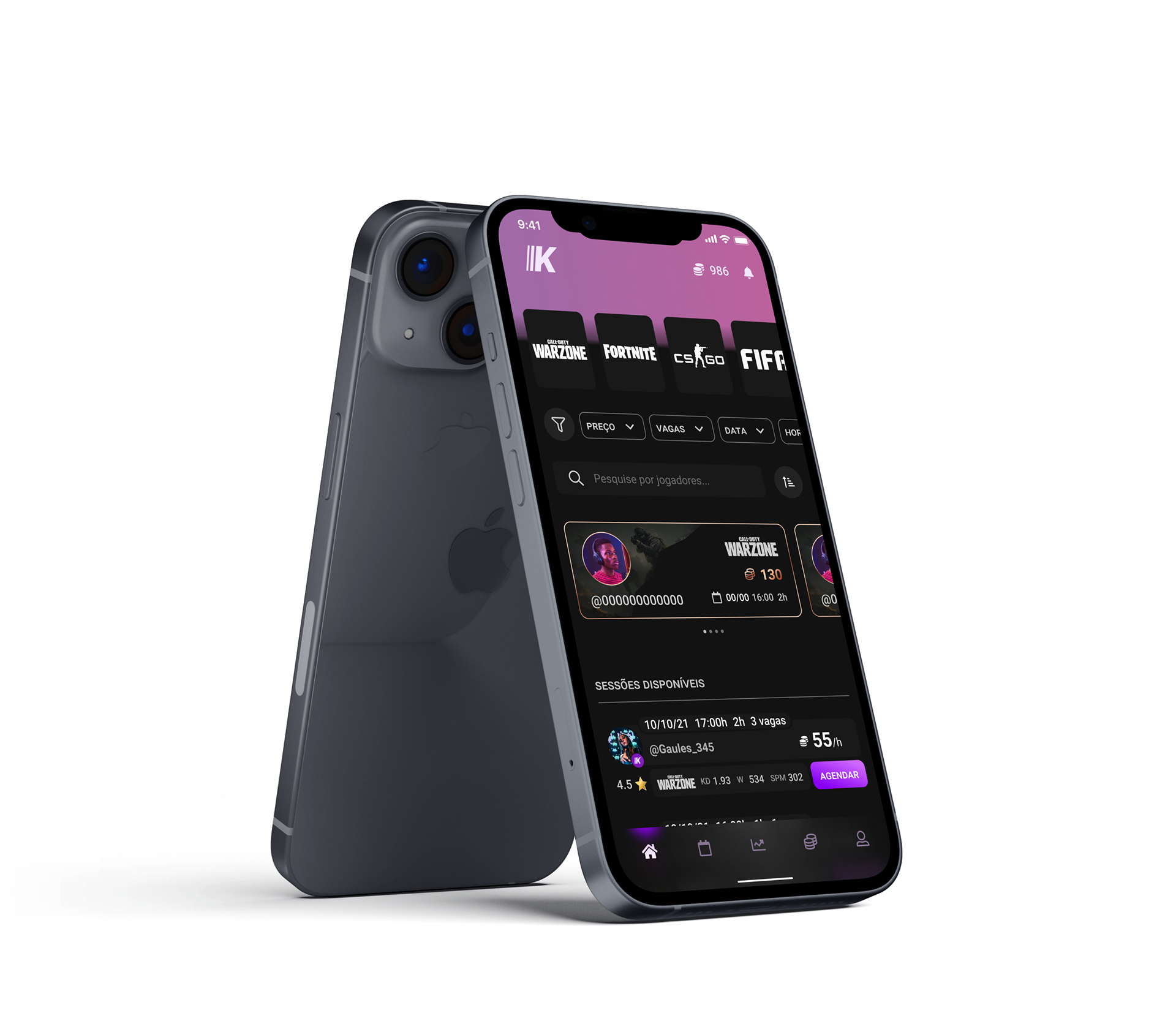 Knowbie on the App StoreView on the App Store ↗
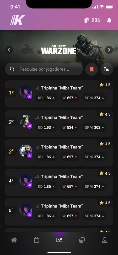 Knowbie on the Play StoreView on the Play Store ↗
Selling attention is hard. Selling a booked hour is not.
Need help with a mobile or web product?
I work with product teams on UX, UI and design systems. Tell me about your project.
Get in touch